対象者
- Flutterでアプリ開発を始めたばかりの人
- UIデザインやウェブデザインに関心があり、効果的なボタンデザインを学びたいと考えている人
- 簡単にカスタマイズできるボタンを探している人
はじめに
Flutterを使ったアプリ開発を始めたばかりのあなたへ、ボタンデザインに悩んでいませんか? ボタンはアプリの見た目や使いやすさに大きく影響するため、デザインやスタイルにこだわりたいところです。しかし、どのようなボタンがあるのか、どのようにカスタマイズできるのかを知らなければ、アプリのデザインを最適化することは難しいでしょう。
この記事では、Material 3を使った様々なボタンデザインを一覧で紹介し、それぞれのボタンの外観やカスタマイズ方法について詳しく解説しています。記事を読むことで、あなたが簡単に実装できるボタンデザインを見つけることができるでしょう。
FilledButton、OutlinedButton、FloatingActionButtonなど、さまざまなタイプのボタンに加えて、角丸や丸い形状、アイコン付きやテキストだけのボタンなど、バリエーション豊かなデザインが紹介されています。また、各ボタンのコード例も掲載しているため、すぐにコピペして使うことができます。
アプリ開発を始めたばかりの方でも、この記事を読むことでボタンデザインの幅が広がり、アプリの見た目をより魅力的にすることができるでしょう。ぜひ、自分のアプリにぴったりのボタンデザインを見つけて、アプリの使いやすさや見た目を向上させましょう!
実施するソース
Material 3を有効化
class MyApp extends StatelessWidget {
  @override
  Widget build(BuildContext context) {
    return MaterialApp(
      title: 'Flutter Demo',
      theme: ThemeData(
        useMaterial3: true,
        colorSchemeSeed: Colors.blue,
      ),
      home: const MyHomePage(title: 'Flutter Demo Home Page'),
    );
  }
}
FilledButton(通常)
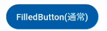
FilledButton(
  onPressed: () {},
  child: Text('FilledButton(通常)'),
),
通常のFilledButtonを作成します。
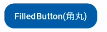
FilledButton(角丸)
FilledButton(
  onPressed: () {},
  style: OutlinedButton.styleFrom(
    shape: RoundedRectangleBorder(
      borderRadius: BorderRadius.circular(16),
    ),
  ),
  child: Text('FilledButton(角丸)'),
),
角丸のFilledButtonを作成します。RoundedRectangleBorderを使って角丸の形状を定義します。
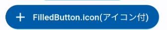
FilledButton.icon(アイコン付)
FilledButton.icon(
  onPressed: () {},
  icon: Icon(Icons.add),
  label: Text('FilledButton.icon(アイコン付)'),
),
アイコン付きのFilledButtonを作成します。iconとlabelプロパティにアイコンとテキストを指定します。
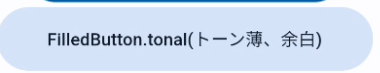
FilledButton.tonal(トーン薄、余白)
FilledButton.tonal(
  onPressed: () {},
  style: FilledButton.styleFrom(
    padding: EdgeInsets.symmetric(horizontal: 40, vertical: 15),
  ),
  child: Text('FilledButton.tonal(トーン薄、余白)'),
),
トーン薄のFilledButtonを作成します。styleプロパティにpaddingを指定して余白を追加します。
OutlinedButton(通常・横丸)

OutlinedButton(
  onPressed: () {},
  child: Text('OutlinedButton(通常)'),
),
通常のOutlinedButtonを作成します。
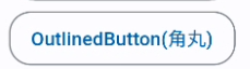
OutlinedButton(角丸)
OutlinedButton(
  onPressed: () {},
  child: Text('OutlinedButton(角丸)'),
  style: OutlinedButton.styleFrom(
    shape: RoundedRectangleBorder(
      borderRadius: BorderRadius.circular(16),
    ),
  ),
),
角丸のOutlinedButtonを作成します。RoundedRectangleBorderを使って角丸の形状を定義します。
FilledButton(丸)

FilledButton(
  onPressed: () {},
  child: Text('丸'),
  style: FilledButton.styleFrom(
    shape: const CircleBorder(),
  ),
),
丸いFilledButtonを作成します。CircleBorderを使って丸い形状を定義します。
OutlinedButton(丸)

OutlinedButton(
  onPressed: () {},
  child: Text('丸'),
  style: OutlinedButton.styleFrom(
    shape: const CircleBorder(),
  ),
),
丸いOutlinedButtonを作成します。CircleBorderを使って丸い形状を定義します。
FloatingActionButton

FloatingActionButton(
  onPressed: () {},
  child: Text('FAB'),
),
FloatingActionButtonを作成します。通常、アプリケーションの主要なアクションを示すために使用されます。
TextButton
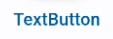
TextButton(onPressed: () {}, child: Text('TextButton')),テキストだけのボタンを作成します。
IconButton

IconButton(onPressed: () {}, icon: Icon(Icons.add)),アイコンのみのボタンを作成します。
外枠付きIconButton

CircleAvatar(
  child: IconButton(onPressed: () {}, icon: Icon(Icons.add)),
),
CircleAvatarの中にIconButtonを配置します。これにより、アイコンボタンが丸い形状を持つようになります。
それぞれのボタンの使い分け
FilledButton
目立たせたいCTA(Call to Action)や重要なアクションに最適です。FilledButtonは背景色が塗られているため、注目を集めやすくなります。通常、主要なアクションや確認ボタンなどに使用されます。
OutlinedButton
補助的なアクションや、あまり目立たせたくない機能に使用します。枠線がありますが、背景色が透明なので、FilledButtonほど目立ちません。キャンセルボタンや副次的なアクションに適しています。
TextButton
シンプルなテキストリンクのようなデザインで、目立たせる必要がないアクションや、リンクに使用されます。例えば、ログイン画面での「パスワードを忘れた場合」や、規約・ポリシーへのリンクなどに使われます。
IconButton
アイコンだけで構成されたボタンで、主にツールバーやナビゲーションバーなどで使用されます。アイコンによって機能が示されるため、省スペースで表現できます。
FloatingActionButton
画面に浮かんで表示される丸いボタンで、主に追加や編集などのアクションに使用されます。ユーザーがすぐにアクセスできるよう、画面の隅に配置されることが多いです。
CTA用のボタンは、目立たせたい場合はFilledButtonを選ぶのが一般的です。ただし、デザインや目的に応じて、OutlinedButtonやTextButtonをCTAとして使用することもあります。
まとめ
今回の記事では、初心者にも分かりやすく、様々な外観のボタンを一覧にして解説しています。簡単にカスタマイズできるボタンデザインが満載で、アプリのデザインを格上げできます。Material 3を利用して、これまでにない魅力的なボタンを実現しましょう。記事では、角丸やアイコン付き、丸い形状のボタンなど、実用的で見た目にも優れたデザインをご紹介。これを参考に、自分のアプリに適したボタンを作成してみてください。
参考
全ソース
import 'package:flutter/material.dart';

void main() {
  runApp(const MyApp());
}

class MyApp extends StatelessWidget {
  const MyApp({Key? key}) : super(key: key);

  @override
  Widget build(BuildContext context) {
    return MaterialApp(
      title: 'Flutter Demo',
      theme: ThemeData(
        useMaterial3: true,
        colorSchemeSeed: Colors.blue,
      ),
      home: const MyHomePage(title: 'Flutter Demo Home Page'),
    );
  }
}

class MyHomePage extends StatefulWidget {
  const MyHomePage({Key? key, required this.title}) : super(key: key);

  final String title;

  @override
  State<MyHomePage> createState() => _MyHomePageState();
}

class _MyHomePageState extends State<MyHomePage> {
  @override
  Widget build(BuildContext context) {
    return Scaffold(
      appBar: AppBar(
        title: Text(widget.title),
      ),
      body: Column(
        children: [
          // 通常のFilledButton
          FilledButton(
            onPressed: () {},
            child: Text(
              'FilledButton(通常)',
            ),
          ),

          // 角丸のFilledButton
          FilledButton(
            onPressed: () {},
            style: FilledButton.styleFrom(
              shape: RoundedRectangleBorder(
                borderRadius: BorderRadius.circular(16),
              ),
            ),
            child: Text(
              'FilledButton(角丸)',
            ),
          ),

          // アイコン付きのFilledButton
          FilledButton.icon(
            onPressed: () {},
            icon: Icon(Icons.add),
            label: Text('FilledButton.icon(アイコン付)'),
          ),

          // トーンが薄、余白のあるFilledButton
          FilledButton.tonal(
            onPressed: () {},
            style: FilledButton.styleFrom(
              padding: EdgeInsets.symmetric(horizontal: 40, vertical: 15),
            ),
            child: Text(
              'FilledButton.tonal(トーン薄、余白)',
            ),
          ),

          // 通常のOutlinedButton(枠線のみのボタン)
          OutlinedButton(
            onPressed: () {},
            child: Text('OutlinedButton(通常)'),
          ),

          // 角丸のOutlinedButton
          OutlinedButton(
            onPressed: () {},
            child: Text('OutlinedButton(角丸)'),
            style: OutlinedButton.styleFrom(
              shape: RoundedRectangleBorder(
                borderRadius: BorderRadius.circular(16),
              ),
            ),
          ),

          // 丸いFilledButton
          FilledButton(
            onPressed: () {},
            child: Text('丸'),
            style: FilledButton.styleFrom(
              shape: const CircleBorder(),
            ),
          ),

          // 丸いOutlinedButton
          OutlinedButton(
            onPressed: () {},
            child: Text('丸'),
            style: OutlinedButton.styleFrom(
              shape: const CircleBorder(),
            ),
          ),

          // FloatingActionButton
          FloatingActionButton(
            onPressed: () {},
            child: Text('FAB'),
          ),

          // TextButton(テキストのボタン。リンク風)
          TextButton(onPressed: () {}, child: Text('TextButton')),

          // IconButton(外枠のないアイコンだけのボタン)
          IconButton(onPressed: () {}, icon: Icon(Icons.add)),

          // CircleAvatar内にIconButton(外枠のあるアイコンのボタン)
          CircleAvatar(
              child: IconButton(onPressed: () {}, icon: Icon(Icons.add))),
        ],
      ),
    );
  }
}