したかったこと
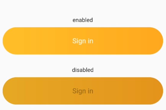
現在の携わっているFlutterのプロジェクトは、もともとデザイン中心のテンプレートからアプリ開発を行っている。ボタンが横丸かつ微妙にグラデーション掛かってて、おしゃれで、デザイン的には気に入っている。ただ、内部的にはContainerをGestureDetectorでラップしているため、ボタンを無効にする、というボタン特有の行為ができない。そこで、デザインをそのままで、ボタンと機能するコードにしたかった。
ここでの単語
- 横丸:ボタンの横が完全に丸っこいこと
- 角丸:ボタンの角がちょっと丸っこいこと
問題点
横丸ボタンの設定とグラデーションの設定を実施すると、横丸の設定(StadiumBorder)がなくなってしまう。横丸ボタンとグラデーションボタンを参考に、両方の設定が入っているつもりのソースを書いたが、横丸にはならなかった。
横丸ボタン
ElevatedButton(
  style: ElevatedButton.styleFrom(
    shape: const StadiumBorder(),
  ),
),
グラデーションボタン
ElevatedButton(
  child: Container(
    decoration: BoxDecoration(
      gradient: LinearGradient(
        colors: [Color(0xfffec230), Color(0xfff9a825)],
      ),
    ),
  ),
),
角丸でグラデーションのあるボタンの候補1
Container(
    height: 20,
    width: 150,
    decoration: BoxDecoration(
      gradient: LinearGradient(
        colors: [Color(0xfffec230), Color(0xfff9a825)],
      ),
    ),
    child: ElevatedButton(
        onPressed: () {},
        style: ElevatedButton.styleFrom(
          backgroundColor: Colors.transparent,
          shadowColor: Colors.transparent,
          shape: const StadiumBorder(),
        ),
        child: Text('ABC')))
角丸でグラデーションのあるボタンの候補2
ElevatedButton(
      onPressed: () {},
      style: ElevatedButton.styleFrom(
        backgroundColor: Colors.transparent,
        shadowColor: Colors.transparent,
        shape: const StadiumBorder(),
      ),
      child: Container(
          height: 20,
          width: 150,
          decoration: BoxDecoration(
            gradient: LinearGradient(
              colors: [Color(0xfffec230), Color(0xfff9a825)],
            ),
          ),
          child: Text('ABC')),
    ),
解決策
横丸の設定を使うのではなく、最大限に角丸な設定にした。StadiumBorder()の設定を使うのではなく、BorderRadius.circular(height/2)で、ボタンの高さの半分 角丸なボタンにした。
完成コード
class MyElevatedButton extends StatelessWidget {
  final BorderRadiusGeometry? borderRadius;
  final Gradient gradient;
  final VoidCallback? onPressed;
  final String message;
  final double height = 67.0;

  const MyElevatedButton({
    Key? key,
    required this.onPressed,
    required this.message,
    this.gradient =
        const LinearGradient(colors: [Color(0xfffec230), Color(0xfff9a825)]),
    this.borderRadius,
  }) : super(key: key);

  @override
  Widget build(BuildContext context) {
    final borderRadius = BorderRadius.circular(height / 2.0);
    return Container(
      width: double.infinity,
      height: height,
      margin: const EdgeInsets.symmetric(
        horizontal: 10,
        vertical: 10,
      ),
      decoration: BoxDecoration(
        gradient: gradient,
        borderRadius: borderRadius,
      ),
      child: ElevatedButton(
        onPressed: onPressed,
        style: ElevatedButton.styleFrom(
          backgroundColor: Colors.transparent,
          shadowColor: Colors.transparent,
          shape: RoundedRectangleBorder(borderRadius: borderRadius),
        ),
        child: Text(
          message,
          style: const TextStyle(
            fontSize: 17,
            fontWeight: FontWeight.normal,
          ),
        ),
      ),
    );
  }
}